 Colour is one of the most powerful tools in marketing with visual clues at their strongest when closely associated with one particular shade.
The ATP Tennis tournament that concluded last night in London has provided a masterclass in how colour can be used to create a very distinctive presentation.
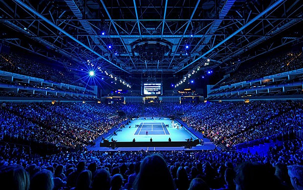
The O2 Arena has been awash in blue for the past week as seen in the images above. That shade is down to the overall sponsor Barclays and Blue has always traditionally been a primary colour within banking and financial services companies.
The impressive thing about London though was that all of the court side advertising was in the same shade so that Emirates, normally red, Mercedes Benz, silver and other very familiar brands were willing to stay with the event despite being deprived of a key asset.
In marketing it’s all about catching the eye and this one off switch was both visually arresting and, one would imagine, quite powerful in terms of style as well as audience recognition and recall.
Because of the uniformity of the colour scheme, those instances where it was broken stood out even more, especially with Rolex who maintained their tradition green and gold clock in the corner and Fed Ex who supplied the players seems in their traditional purple and orange on white.
The trick there was to stand out with spot colour as designers and printers have known the value of for a long time.
It would be interesting to see such an experiment in colour tried out at the Aviva Stadium for an RBS Six Nations match, in similar fashion to the upside down banners used by Paddy Power on occasion.
Sometimes it needs a little different thinking to stand out from the crowd. The irony of the ATP finals is that it was the uniformity that was so arresting. Food for thought.